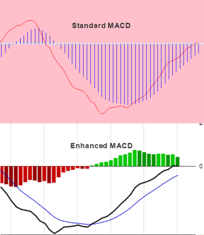
The Moving Average Convergence Divergence (MACD) is a trend-capturing momentum indicator used by professional traders.
Standard MACD Indicator
The MACD shows the relationship between two moving averages of prices. The MACD was created by Gerald Appel in the late 1970s. The MACD indicator is the difference of the 12-day Exponential Moving Average (EMA) and the 26-day EMA.
A nine-day EMA of the MACD is known as the signal line, which is plotted on top of the MACD. The MACD is a lagging indicator, also being one of the best trend-following indicators that has withstood the test of time.
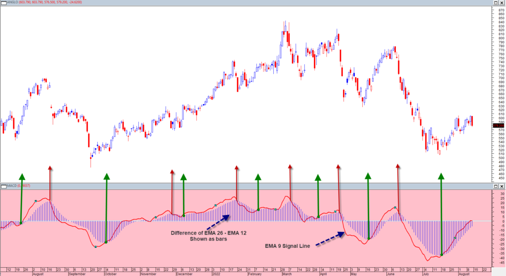
MACD Signals:
- A potential bullish entry signal is given when the indicator crosses its signal line upwards.
- A potential bullish entry signal is given when the indicator crosses its zero value. (Lags the signal line crossing)
- Extreme trough turns are also seen as potential bullish entry signals.
- A potential bearish (exit) signal is given when the indicator crosses its signal line downwards.
- A potential bearish (exit) signal is given when the indicator crosses its zero value downwards. (Lags the signal line crossing)
- Extreme peak turns are also seen as potential bearish exit signals.
This system is shown on the graph of Anglo American below showing the signal line crossings.
Advantages of MACD:
- One of the biggest advantages of the MACD is that it’s both a trend and momentum indicator.
- It is helpful to spot trend reversals.
- The system keeps you in a trend, ignoring the daily volatility.
- One of the reasons that MACD is so popular is because its trading signals are fairly unambiguous.
Disadvantages of MACD:
- Its biggest flaw is that it gives the signals later than the price action itself.
- It struggles particularly in sideways markets.
- It can often signal a possible reversal but then no actual reversal actually happens.
MACD Enhanced
We did not change any fundamentals of the basic MACD formula, but only made some graphical enhancements.
Enhancements:
- The MACD is now shown as a line chart instead of the original bar chart.
- The signal line crossover are shown as 2 lines crossing.
- The difference between the MACD and Signal line is shown as color bars.
- The positive bars above the zero value are shown in a green color. (Signal Line > MACD )
- The negative bars below the zero value are shown in a red color. (Signal Line < MACD )
- When a positive MACD value is less than the previous day’s value, the light green color is shown as dark green, indicating change of direction or a possible peak.
- When a negative MACD value is greater than the previous day’s value, the dark red color is shown as light red, indicating change of direction or a possible trough.
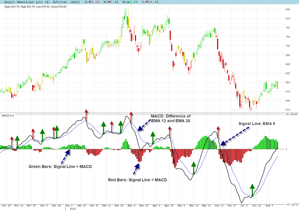
Comments:
- The actual crossover of the MACD with the signal line can now be seen as 2 lines crossing.
- As the MACD is seen as a lagging indicator, the color change can be used as an early or short term signal for overextended MACD values.
- Color changes can be as volatile as short term price movements and should preferably be used with another technical indicator.
MACD & Frontrunner + Heatmaps
We are showing the graph of Berkshire Hathaway to discuss how Frontrunner and MACD can be used together.
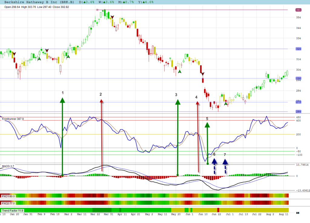
- At position 1 Frontrunner broke up and the MACD changed color to indicate a possible trough. The MACD signal line crossing confirmed a few days later. (lagging)
- At this position Frontrunner has already broken down in overbought territory and was confirming with divergence and a color change from the MACD. The lagging signal crossing followed a few days later.
- We had a bounce in a bear trend at this position with the MACD confirming.
- Frontrunner broke down with MACD confirming the continuation of the bear trend.
- Frontrunner broke up in extreme oversold territory, but its value below -100 warned that the bottom has not been reached.
- MACD changed color in the extreme oversold territory to warn about a possible price trough. Frontrunner was now indicating divergence with the MACD confirming with a color change.
- The MACD finally gave its signal line crossing signal.
MACD & Divergence
Some technical signals are easier to use for divergence than others. We find it difficult to spot divergence with the MACD. It does not give as much signals as other indicators, but when it does, it is usually accurate. Some analysts also believe that you must only look for bullish divergence when the price of a share is above its 200 day moving average, and bearish divergence when it is below its 200 day moving average.
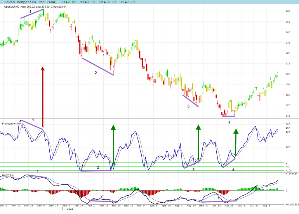
Divergence signals for Frontrunner and the MACD are shown on the graph of Lowes Companies.
- Top divergence was given by Frontrunner and MACD.
- Bottom divergence was given by both indicators.
- No divergence for the MACD at this position.
- While Frontrunner showed divergence for the bottom turn very clearly, the MACD also had divergence, but not as visible as that of Frontrunner.
MACD & Trendlines
Trend lines can be used with the MACD as a confirmation signal for each other.
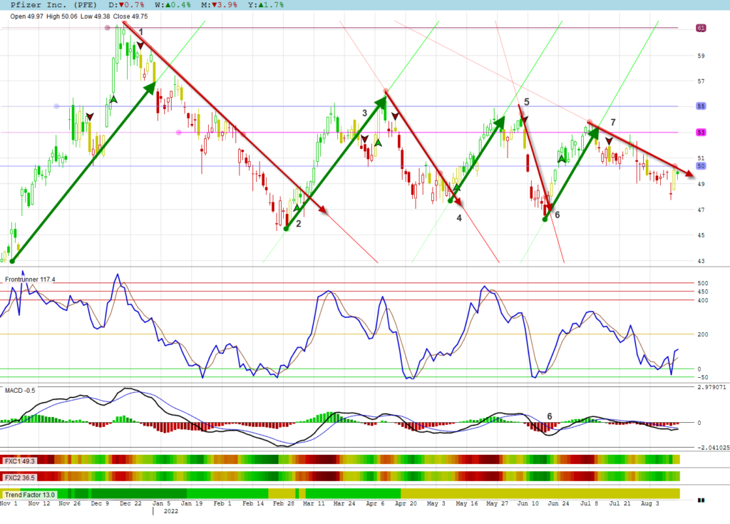
Trendlines on the graph of Pfizer are discussed below.
- At position 1, the trend line break confirmed the MACD signal.
- Similarly for position 2.
- The MACD signal came very late, so did the trend line break. A bounce came and the MACD confirmed the negative trend.
- At position 4 the MACD confirmed the trend line break.
- The MACD confirmation came 8 days after the trend line break and another bounce.
- The MACD confirmation of the trend line break came much too late, but do notice the color change confirmation on the indicator chart. (Overextended MACD color change)
- Confirmation of the trend line break came a few days after the break.
Overextended MACD Color Changes – Sideways Movements
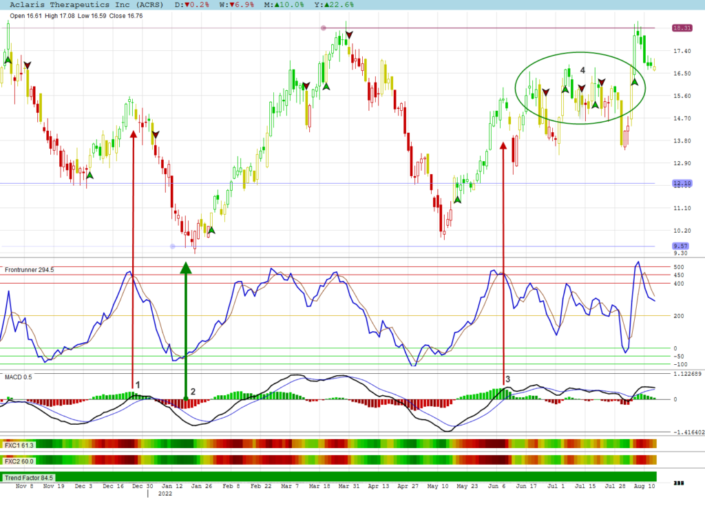
When you get overextended price movements at the end of a trend, Change of direction can best be seen with a color change of the bars shown on the MACD indicator.
The MACD is not suited for sideways markets and is best suited for trending charts.
We show these phenomena’s on the chart of Aclaris Therapeutics.
- At 1 we had an extended move of price and frontrunner. The color changed marked the peak together with a Frontrunner break.
- Similarly for position 2 and 3.
- In the circle at 4 you can see how the MACD is not suited for sideways markets at all.
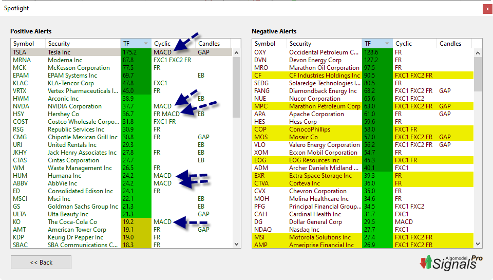
Finding MACD Signals
You can easily find MACD signals in Algomodel Signals Pro by running the exploration Spotlight.
The columns in the explorations can be sorted to group the similar signals together. By default shares are sorted according to their Trend Factor. Any graph can be opened by clicking on the preferred share in the list.
Using MACD in Algomodel Signals Pro
The MACD can be added as a chart on any template in Algomodel Signals Pro.
To add the MACD chart, do the following steps:
- Right click on a chart window and choose the option: Add Chart. Then select MACD from the list.
- You can then move the chart up or down to your preferred position be right clicking on it and select Move Chart Up or Move Chart Down.
- The size of the window can also be increase by dragging the bottom or top border line.
- Once you are happy with your layout, right click again and choose the option: Save Template. Enter your preferred name for this template.
- Your new template is now available in the Template selection box for future usage.