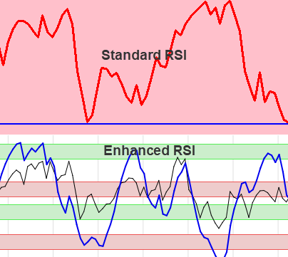
The Relative Strength Index (RSI) is among the most popular technical indicators for identifying overbought or oversold stocks.
Standard RSI Indicator
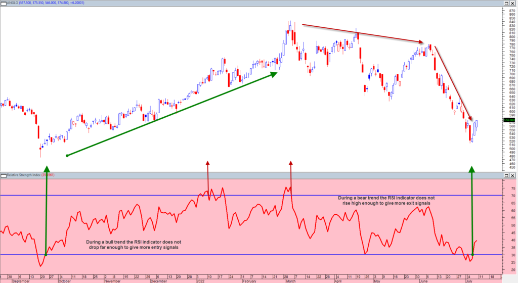
The standard RSI system uses a 14 days period to calculate the indicator. Overbought (value>70) refers to a stock that has increased rapidly in a short period of time and may reverse lower. Conversely, oversold (value<30) refers to a stock that has decreased sharply in a short period of time and may reverse higher.
A potential bullish entry signal is given when the indicator crosses its 30 value upwards.
A potential bearish (exit) signal is given when the indicator crosses its 70 value downwards.
This system is shown on the graph of Anglo American below.
Disadvantages with this system are:
- The period 14 are too long, as no stock gain more than 9 periods consecutively.
- During a bull trend the indicator hardly ever drops below 30 to give more entry signals.
- Similarly during a bear trend the indicator does not rise high enough (>70) to give more exit signals.
- The graph of the RSI is very volatile.
- Cross over signals usually lags the actual turning point with a few periods.
RSI at a Higher Level
To counter the problems with the standard RSI, the following were done:
- The period used for the RSI was reduced to 9.
- Different ranges are used for a bull and bear trend.
- Signal ranges for a bull market were raised to: 40/50 & 80/90. (Shown as green ranges)
- Signal ranges for a bear were dropped to: 30/40 & 55/65. (Shown as red ranges)
- In addition a new smooth enhanced RSI signal was created to take away the volatility of the standard RSI.
- The new enhanced signal ranges between 0 and 100 to give extreme overbought and oversold conditions.
- The new enhanced signal is incorporated in the heatmap indicator FXC1.
RSI(9) with Adjusted Levels
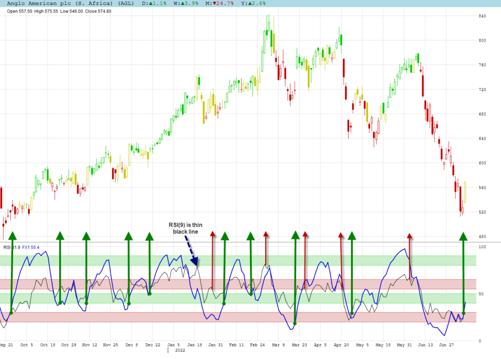
As a comparison with the standard RSI we show the RSI(9) with adjusted signal levels.
- A bull trend is defined when the most recent bottom is higher than the previous bottom.
- A bear trend is defined when the most recent top is lower than the previous top.
- The green signal ranges are used for a bull trend.
- The red signal ranges are used for a bear trend.
- A cross over is still used for a signal.
- The RSI(9) is the thin black line on the RSI chart.
Comments:
- You now get much more signals compared to the RSI(14) with its 30/70 signal lines.
- The RSI did not rise high enough to give exit signs during the bull trend period.
- Both range lines can be used for a signal, but only the first signal is used if both are crossed.
- If you missed out to enter during the bull run, the adjustments now gives many more enter signals.
Enhanced RSI Example
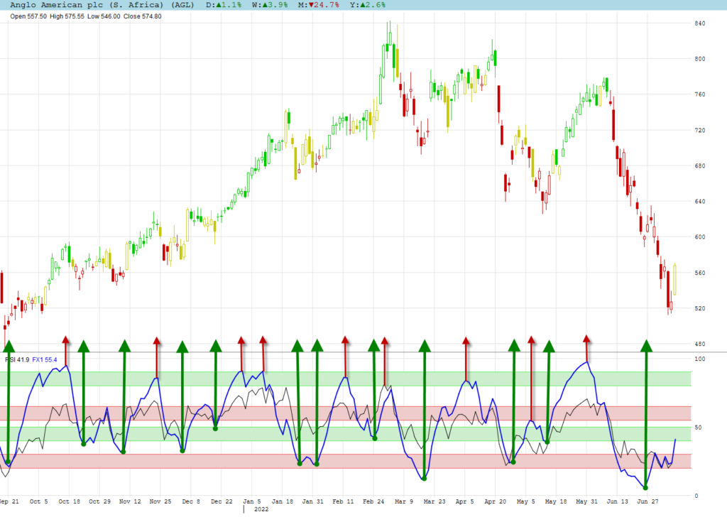
We adjusted the RSI(9) to smooth the volatility and stretched it to move to the extremes of 0 and 100 to use its turning points instead of the cross overs. The dark blue line is the enhanced RSI on the graph.
Comments:
- We now even have more signals, but do remember that any signal needs confirmation to counter false signals.
- A turning point signal is given earlier than a cross over signal, which makes confirmation even more important.
Enhanced RSI & Heatmaps
The enhanced RSI is incorporated into FXC1 and shown as a heatmap for oversold or overbought.
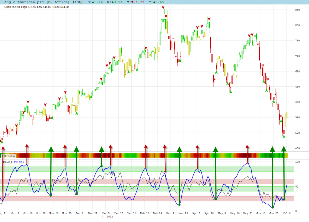
Comments:
- Although all turning point are shown for FXC1 on the graph, only the extreme should be used with confirmation.
- Extreme positions are dark green and dark red.
- We prefer to use Frontrunner with the heatmaps as the enhanced RSI is already incorporated in it.
Enhanced RSI & Divergence
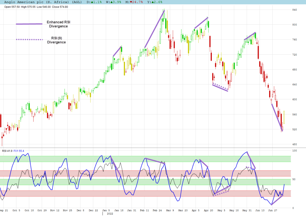
The RSI is a popular indicator to be used for divergence. Compared to Frontrunner it does not give nearly as much signals. Even the RSI (9) only gave 2 divergence signals during the period shown for Anglo American. The enhanced RSI did a better job by giving 6 divergence signals for the same period.
Using RSI in Algomodel Signals Pro
Although RSI is incorporated in FXC1, it can be used on its own in Algomodel Signals Pro.
To add the RSI chart, do the following steps:
- Right click on a chart window and choose the option: Add Chart. Then select RSI from the list.
- You can then move the chart to up or down to your preferred position be right clicking on it and select Move Chart Up or Move Chart Down.
- The size of the window can also be increase by dragging the bottom or top border line.
- Once you are happy with your layout, right click again and choose the option: Save Template. Enter your preferred name for this template.
- Your new template is now available in the Template selection box for future usage.

